纯CSS绘制箭头
用CSS即可绘制出各种箭头,无需裁剪图片,甚至没有用到 CSS3 的东西。对浏览器支持良好。
边框箭头
原理非常简单,通过截取border的部分“拐角”实现

<style>
    .box_01 {
        padding: 10px 0;
        text-align: center;
    }
    .box_01 .item_01 {
        display: inline-block;
        width: 80px;
        height: 80px;
        margin: 20px 0;
        background: rgba(255, 0, 0, 0.1);
        border-color: red;
        border-width: 0 0 1px 1px;
        border-style: solid;
        transform: rotateZ(-45deg);
    }
</style>
<section class="box_01">
    <em class="item_01"></em>
</section>
实心箭头
当元素宽、高为零,且其他边为透明颜色时,可以形一个三角形。改变各个边的宽度,即通过调整“边框”厚度可以配置出任意角度

<style>
    .box_01 .item_02 {
        display: inline-block;
        width: 0;
        height: 0;
        border: 50px solid transparent;
        border-top-color: #0dd;
    }
</style>
<section class="box_01">
    <em class="item_02"></em>
</section>
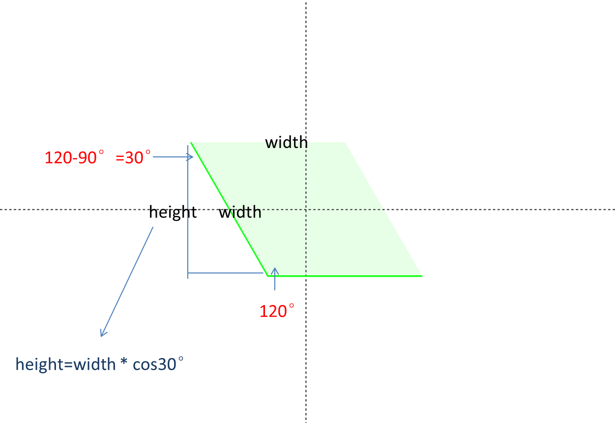
90°之外的箭头
常见的箭头设计是大于90°的,在上面例子的基础上,“压扁”或“拉长”矩形不就可以了吗?而“压扁”或“拉长”需要用skew()就能实现,只不过需要做些角度的计算。
按照width: 100px;角度120°的需求来定义边长、角度两个变量。height = width * cos(30°) = width * sin(60°)。

<style>
    .box_01 .item_03 {
        display: inline-block;
        width: 100px;
        height: 86px;
        transform: rotate(-30deg) skewX(30deg);
        background: #e4ffe7;
        border-bottom: 1px solid #00ff22;
        border-left: 1px solid #00ff22;
    }
</style>
<section class="box_01">
    <em class="item_03"></em>
</section>

<style>
    .box_04 {
        padding: 0;
        position: relative;
        height: 80px;
    }
    .box_04 .item_04 {
        position: absolute;
        left: 40%;
        width: 10px;
        height: 40px;
        background: #f50;
    }
    .box_04 .item_04:nth-child(1) {
        top: 0;
        transform: skewX(30deg);
    }
    .box_04 .item_04:nth-child(2) {
        bottom: 0;
        transform: skewX(-30deg);
    }
</style>
<section class="box_04">
    <div class="item_04"></div>
    <div class="item_04"></div>
</section>
transform: matrix() 用法详解
transform: matrix() 是CSS中最强大但也最复杂的变换函数,它允许你通过一个 6 值矩阵执行2D变换。
核心概念
matrix(a, b, c, d, tx, ty)
参数对应以下变换:
a和d:控制缩放(x轴和y轴)b和c:控制倾斜tx和ty:控制平移(x轴和y轴)
即,对应以下值:
matrix(scaleX, skewY, skewX, scaleY, translateX, translateY)
角度和弧度
角度 (Degrees):源于古巴比伦文明的60进制计数系统。将一个圆等分为360份的单位,即,完整的圆 = 360°,平角 = 180°,直角 = 90°。
弧度 (Radians):国际单位制中的标准角度单位。基于圆的半径的单位,1弧度 = 半径长度的弧所对的圆心角,一个完整的圆 = 2π弧度 (约6.283弧度)。
弧度 = 角度 × (π/180)
角度 = 弧度 × (180/π)
角度在日常生活中更常见,弧度在高等数学和物理学中更常用。弧度使许多数学公式更加简洁,特别是在微积分中
变换函数的等价关系
未变换
matrix(1, 0, 0, 1, 0, 0)
平移:translate() 转 matrix()
translate(tx, ty)
matrix(1, 0, 0, 1, tx, ty)
缩放:scale() 转 matrix()
scale(sx, sy)
matrix(sx, 0, 0, sy, 0, 0)
倾斜:skew() 转 matrix()
skew(θx, θy)
matrix(1, tan(θy), tan(θx), 1, 0, 0)
旋转:rotate() 转 matrix()
rotate(θ)
matrix(cosθ, sinθ, -sinθ, cosθ, 0, 0)
const angle = 60;
const rad = angle * Math.PI / 180;
const sin = Math.sin(rad);
const cos = Math.cos(rad);

transform: matrix(cosθ, sinθ, -sinθ, cosθ, 0, 0);
transform: matrix(0.5000000000000001, 0.8660254037844386, -0.8660254037844386, 0.5000000000000001, 0, 0);