CSS3探索系列之gradient
<gradient> 属于特殊的 <image> 数据类型,用来描述两种及以上颜色之间的平滑过渡。它只能用在接受 <image> 类型的属性上,不能用于 background-color 这类接收 <color> 颜色类型的属性。
日常开发中绝大多数场景,渐变都是作为 background-image 背景图像使用;凡是可以设置背景图像的属性,都可以传入渐变函数。
渐变容器(渐变框)
渐变图像是逻辑上无限延展的图像,浏览器实际渲染出来的可见范围,由渐变容器决定。
- 直接给元素
background-image设置渐变,不修改background-size时,渐变容器默认等于元素的border-box,包含内容区、内边距、边框,不包含外边距,行为和url()引入普通背景图保持一致。 - 如果通过
background-size手动指定尺寸,例如background-size: 200px 200px,渐变容器就被固定为该尺寸;默认background-position: left top,渐变图案从元素左上角开始摆放。 - 配合
background-position、background-repeat,控制渐变容器在元素内的位置与重复行为。
线性渐变 linear-gradient()
颜色沿着一条虚拟的渐变直线发生过渡变化,由 linear-gradient() 生成渐变图像。
linear-gradient([ <angle> | to <side-or-corner> ,]? <color-stop-list>)
<side-or-corner>方位关键字:通过to指定渐变终点朝向,不写默认等价to bottom(从上往下)。可用值:
to left、to right、to top、to bottom、to top left、to bottom right。<angle>角度:使用角度指定渐变线方向,0 deg指向正上方(北方),角度沿顺时针增加,默认180deg等价to bottom。支持单位:
deg:度,一圈 360 度grad:梯度,一圈 400 梯度rad:弧度,一圈 2π 弧度turn:圈,一圈等于1turn90deg = 100grad = 0.25turn ≈ 1.5708rad注意:旧版带
-webkit-、-moz-前缀的渐变,0deg指向右侧(东方),和标准语法定义不一致,迁移旧代码需要留意角度差异。
<color-stop-list>色标列表:由若干个 色标<linear-color-stop>和可选的颜色提示<color-hint>交替组成。<linear-color-stop>:颜色 [位置],位置支持百分比、长度;一个色标也可以写两个位置,用来快速生成硬色带,如red 20% 40%。- 第一个色标省略位置,默认
0%;最后一个色标省略位置,默认100%;中间色标不写位置,自动取前后两个色标位置的中点;如果后面色标的位置数值小于前一个色标,会被修正等于前一个色标的位置,产生硬截断。 <color-hint>颜色提示:写在两个色标之间,用来修改颜色插值的中点,默认中点50%,相邻两个色标之间最多只能放置一个颜色提示。
background-image: linear-gradient(#e33, #45e);
background-image: linear-gradient(#e33, 25%, #45e);
background-image: linear-gradient(#e33 0 25%, #45e);
background-image: linear-gradient(#e33 25%, #f93 10%, #45e);
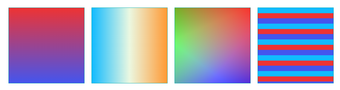
<section class="linear">
    <div class="item linear1"></div>
    <div class="item linear2"></div>
    <div class="item linear3"></div>
    <div class="item linear4"></div>
</section>
.linear1 {
    background-image: linear-gradient(#e33, #45e);
}

.linear2 {
    background-image: linear-gradient(0.25turn, #1bf, #ebf8e1, #f93);
}

.linear3 {
    background-image: linear-gradient(217deg, rgba(255, 0, 0, .8), rgba(255, 0, 0, 0) 70.71%),
        linear-gradient(127deg, rgba(0, 255, 0, .8), rgba(0, 255, 0, 0) 70.71%),
        linear-gradient(336deg, rgba(0, 0, 255, .8), rgba(0, 0, 255, 0) 70.71%);
}

.linear4 {
    background-image: linear-gradient(#1bf 33.33%, #e33 0, #e33 66.66%, #45e 0);
    background-size: 100% 42px;
}
径向渐变 radial-gradient()
颜色从一个中心点向外辐射扩散过渡,由 radial-gradient() 生成图像。
radial-gradient([ <shape> [<extent-keyword> | <size>] at <position> ]? , <color-stop-list>)
<position>中心点位置:格式x y,默认center。支持方位关键字(顺序无影响)、百分比、绝对长度。<shape>渐变形状:circle正圆形,半径只能使用单个长度值;ellipse椭圆形(默认),可以分别设置水平、垂直半径,支持百分比。<size>、<extent-keyword>尺寸边界关键字:closest-side:渐变轮廓碰到距离中心点最近的容器边。closest-corner:渐变轮廓碰到距离中心点最近的容器角。farthest-side:渐变轮廓碰到距离中心点最远的容器边。farthest-corner:默认值;渐变轮廓碰到距离中心点最远的容器角。
<color-stop-list>色标列表:色标、颜色提示规则和线性渐变完全一致。
注意:圆形不能使用百分比半径;椭圆半径可以使用百分比,参照容器对应轴的尺寸。
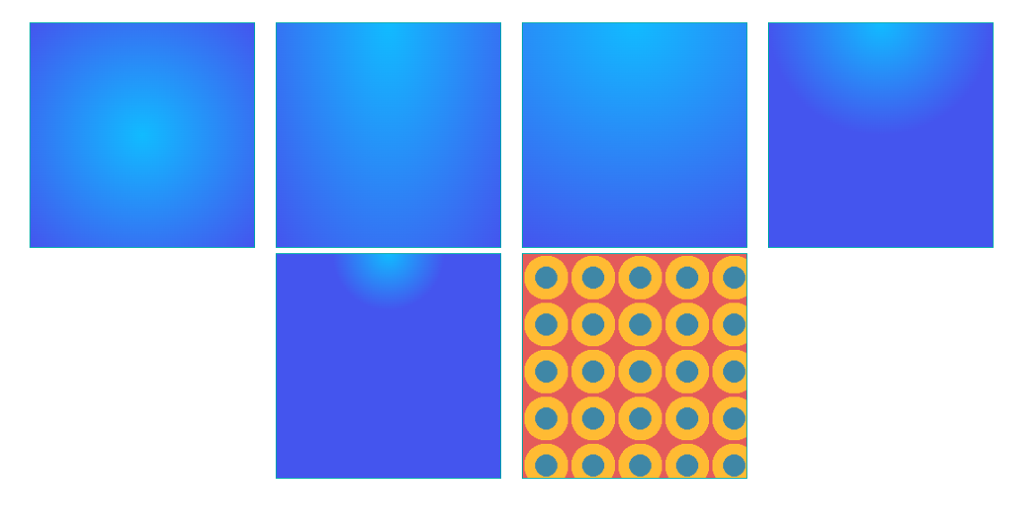
<section class="radial">
    <div class="item radial1"></div>
    <div class="item radial2"></div>
    <div class="item radial3"></div>
    <div class="item radial4"></div>
    <div class="item radial5"></div>
    <div class="item radial6"></div>
</section>
.radial1 {
    background-image: radial-gradient(#1bf, #45e);
}

.radial2 {
    background-image: radial-gradient(at top, #1bf, #45e);
}

.radial3 {
    background-image: radial-gradient(circle at top, #1bf, #45e);
}

.radial4 {
    background-image: radial-gradient(circle closest-corner at top, #1bf, #45e);
}

.radial5 {
    background-image: radial-gradient(ellipse 50px 50px at top, #1bf, #45e);
}

.radial6 {
    background-image: radial-gradient(#3f87a6 33.33%, #fb3 0, #fb3 66.66%, #e45b5a 0);
    background-size: 42px 42px;
}
圆锥渐变 conic-gradient()
颜色围绕中心点顺时针旋转做角度上的过渡,不是向外辐射,适合色轮、饼图、表盘效果,由 conic-gradient() 生成图像。
conic-gradient([ from <angle> ]? [ at <position> ]? , <angular-color-stop-list>)
from <angle>:设置渐变旋转起始角度,默认0deg,从正上方开始顺时针旋转。at <position>:旋转中心点,默认center,语法和径向渐变中心点完全相同。<angular-color-stop-list>:角度色标列表。
注意:色标的位置单位是角度(deg、turn),也可以写百分比(对应360度圆周);支持双位置色标、颜色提示;圆锥渐变色标不接受 px 等长度单位。
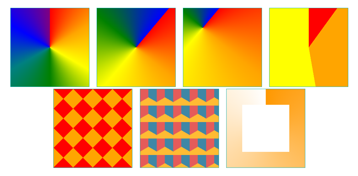
<section class="conic">
    <div class="item conic1"></div>
    <div class="item conic2"></div>
    <div class="item conic3"></div>
    <div class="item conic4"></div>
    <div class="item conic5"></div>
    <div class="item conic6"></div>
    <div class="item conic7"></div>
</section>
.conic1 {
    background-image: conic-gradient(red, orange, yellow, green, teal, blue, purple);
}

.conic2 {
    background-image: conic-gradient(from 40deg, red 0deg, orange 90deg, yellow 180deg, green 270deg, blue 360deg)
}

.conic3 {
    background-image: conic-gradient(from 40deg at 25% 25%, red 0deg, orange 90deg, yellow 180deg, green 270deg, blue 360deg)
}

.conic4 {
    background-image: conic-gradient(red 36deg, orange 36deg 170deg, yellow 170deg);
}

.conic5 {
    background-image: conic-gradient(red 12.5%, orange 0 37.5%, red 0 62.5%, orange 0 87.5%, red 0);
    background-size: 50px 50px;
}

.conic6 {
    background-image: conic-gradient(#3f87a6 33.33%, #fb3 0, #fb3 66.66%, #e45b5a 0);
    background-size: 42px 42px;
}

.conic7 {
    position: relative;
    background: conic-gradient(rgba(255, 152, 0, 1) 0, rgba(255, 152, 0, 0) 100%);
    border: 0;
    text-align: center;
    vertical-align: top;
}

.conic7:after {
    position: absolute;
    top: 20%;
    left: 20%;
    display: block;
    width: 60%;
    height: 60%;
    content: "";
    background: #fff;
}
重复渐变
普通渐变只会执行一次颜色过渡;重复渐变函数会把色标片段循环重复,铺满整个渐变容器。
重复渐变函数参数,和对应的普通渐变函数完全一致:
repeating-linear-gradient():重复线性渐变repeating-radial-gradient():重复径向渐变repeating-conic-gradient():重复圆锥渐变
原理:渐变片段的长度 = 最后一个色标位置 − 第一个色标位置;浏览器将该片段无限平铺。
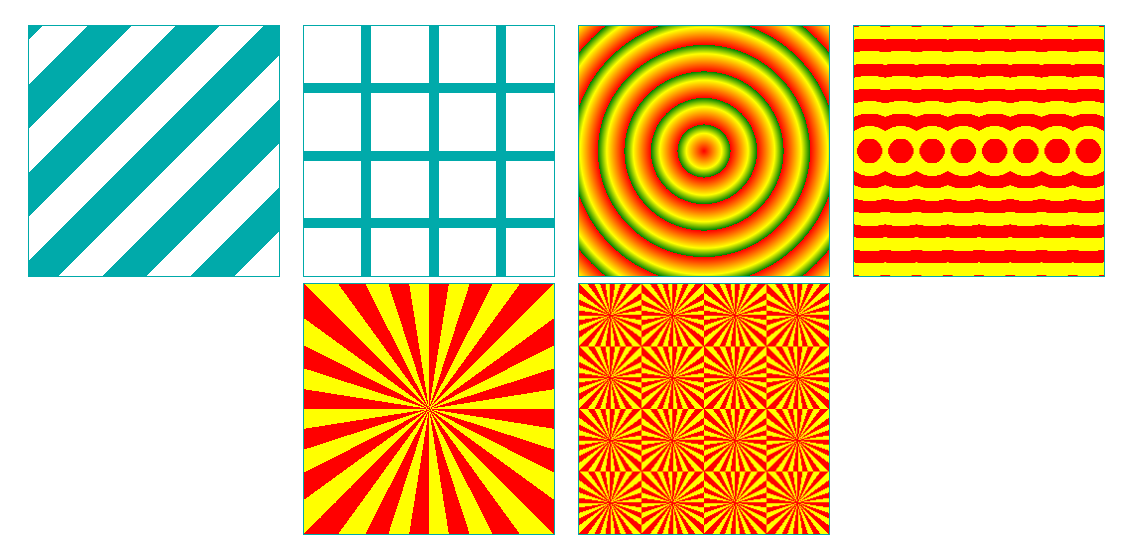
<section class="repeat">
    <div class="item repeat1"></div>
    <div class="item repeat2"></div>
    <div class="item repeat3"></div>
    <div class="item repeat4"></div>
    <div class="item repeat5"></div>
    <div class="item repeat6"></div>
</section>
.repeat1 {
    background-image: repeating-linear-gradient(-45deg, transparent, transparent 25px, #0aa 25px, #0aa 50px);
}

.repeat2 {
    background-image:
        repeating-linear-gradient(transparent, transparent 23%, #0aa 23%, #0aa 27%),
        repeating-linear-gradient(90deg, transparent, transparent 23%, #0aa 23%, #0aa 27%);
}

.repeat3 {
    background-image: repeating-radial-gradient(red, yellow 10%, green 15%);
}

.repeat4 {
    background-image: repeating-radial-gradient(circle, red, red 10px, yellow 10px, yellow 20px);
    background-size: 25px;
}

.repeat5 {
    background-image: repeating-conic-gradient(red 0 9deg, yellow 9deg 18deg);
}

.repeat6 {
    background-image: repeating-conic-gradient(red 0 9deg, yellow 9deg 18deg);
    background-size: 50px 50px;
}
渐变的其他使用场景
渐变既然属于 <image> 类型,除了 background-image,还可以用在任何接受图片的 CSS 属性:border-image、mask-image 等;配合 -webkit-background-clip:text 可以实现文字渐变效果。

<section class="other">
    <div class="item other1"></div>
    <div class="item">
        <div class="other2">愿你走出</div>
    </div>
    <div class="item">
        <div class="other3" text="半生归来">半生归来</div>
    </div>
    <div class="item">
        <svg viewBoxs="0 0 500 300" class="other4 svgBox">
            <defs>
                <linearGradient id="SVGID1_" gradientUnits="userSpaceOnUse" x1="0" y1="10" x2="0" y2="50">
                    <stop offset="0" style="stop-color: #0aa" />
                    <stop offset="1" style="stop-color: orange" />
                </linearGradient>
            </defs>
            <text text-anchor="middle" class="gradient-text-three" x="100px" y="30%">仍是少年</text>
        </svg>
    </div>
</section>
.other1 {
    border: 20px solid transparent !important;
    border-image: linear-gradient(to top, #0aa, orange) !important;
    border-image-slice: 20 !important;
    box-sizing: border-box;
}

.other2 {
    font-size: 42px;
    background-image: linear-gradient(to top, #0aa, orange);
    background-clip: text;
    -webkit-text-fill-color: transparent;
}

.other3 {
    font-size: 42px;
    position: relative;
    color: #0aa;
}
.other3::before {
    position: absolute;
    color: orange;
    -webkit-mask: linear-gradient(to top, #0aa, transparent);
    content: attr(text);
    z-index: 1;
}

.other4 .gradient-text-three {
    fill: url(#SVGID1_);
    font-size: 48px;
}
常见踩坑与兼容
iOS 渐变 rgba 透明度异常
早期 iOS Safari(如 iPhone 11 Pro 等设备的部分版本)对渐变中混用 rgba 透明色和具名颜色可能存在解析问题。以下写法可能导致渲染异常:
background: linear-gradient(to bottom, rgba(255, 0, 0, 0.1), white 10%, white);
解决方案:统一使用 rgba 格式表示所有颜色:
background: linear-gradient(to bottom, rgba(255, 0, 0, 0.1), rgba(255, 255, 255, 1) 10%, rgba(255, 255, 255, 1));
其他注意事项
- 渐变没有固有宽高,不要把它当成普通位图理解;它的大小完全由
background-size或者容器决定。 - 圆锥渐变
conic-gradient()在旧浏览器中兼容性有限(Chrome 69+、Firefox 83+、Safari 12.1+),低版本环境需要降级方案或 polyfill。